In my typographic poster project, I chose the word "SONHOS" (meaning "dreams" in Portuguese) as my focal point. By delving into the concepts of surrealism, abstraction, and the bizarre that are often associated with dreams, I aimed to create a composition that evokes strangeness and curiosity. Dreams are unpredictable and go beyond the confines of reality, often encompassing mystical and unexplainable experiences. Drawing inspiration from the "almost" symmetry of the word, I incorporated symmetry as a foundational element in the composition, creating a sense of balance that relates to a non-human and eccentric nature.


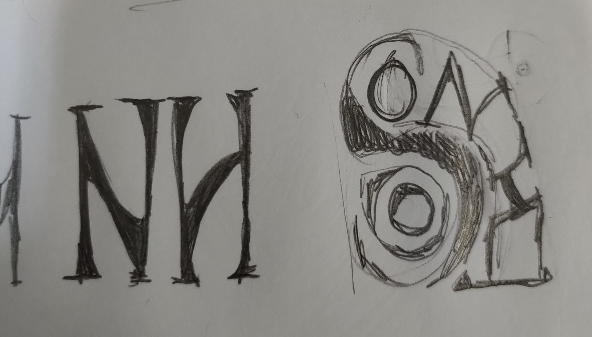
As a starting point, I experimented with multiple already existing type families, aiming to understand the best way to represent this word as well as transmitting the concepts I highlighted.
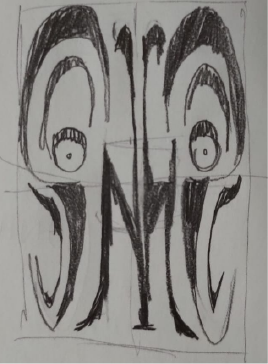
After my experimentations, I focused in on a specific combination of letterforms that strikingly resembled the shape of a butterfly with eyes on it's wings. This particular composition not only captured the visual allure of a butterfly but also resonated with the themes explored in the project. Butterflies are often associated with transformation, growth, and the ethereal nature of dreams. The inclusion of eyes added an element of curiosity and observation, symbolizing the introspective nature of exploring one's dreams and inner world.
Inspired by this concept, I sketched a reference model by hand, meticulously refining the details and proportions to capture the essence of the butterfly's form. Once satisfied with the sketch, I digitized and vectorized the design, ensuring its scalability and precision while retaining the organic and handcrafted feel. This process allowed me to create a visually captivating and meaningful representation of the butterfly-like concept, tying together the themes of transformation, curiosity, and the exploration of dreams.
Hand drawn sketch
Digital version of the sketch
With the sketch in hands, to bring my vision to life on a final version, I employed various techniques of traditional media. Traditional media offers a vast diversity of textures and materials, allowing me to enrich my visuals.
Firstly, I utilized adhesive to highlight the central details and create a bold and striking "S" in the design. Negative painting and outlining techniques were employed to emphasize the smaller "S" letters, adding depth and texture to the composition. The letters "O" were created using stamping techniques, adding a distinctive texture and visual interest to their forms. I further enhanced the "O" by incorporating cut-out circles, creating a playful and layered effect.
For the central "N" and "H" letters, I utilized the technique of flocking to create a velvety texture, adding a tactile element to the design. The use of Foil Quill allowed me to incorporate another butterfly motif on top, reinforcing the ethereal and fleeting nature of dreams.
Traditional Media Experiments
To ensure the uniqueness of the typography, I hand-drew all the letterforms from scratch, resulting in custom and original fonts specifically crafted for this project.
The poster was executed on Canson White A3 200 g/m² paper, providing a sturdy and high-quality canvas for the composition.
Final Version of the Poster :)
My typographic poster project centered around the word "SONHOS" aimed to evoke the surreal and abstract nature of dreams. Through the careful selection and execution of various techniques such as adhesive, negative painting, stamping, cut-out elements, flocking, Foil Quill, and hand-drawn typography, I created a visually intriguing composition that elicits a sense of curiosity and strangeness. The use of symmetry adds an element of equilibrium, contrasting with the eccentricity and unpredictability often associated with dreams. Ultimately, this project showcases my ability to explore unconventional design concepts and push the boundaries of typographic expression.
